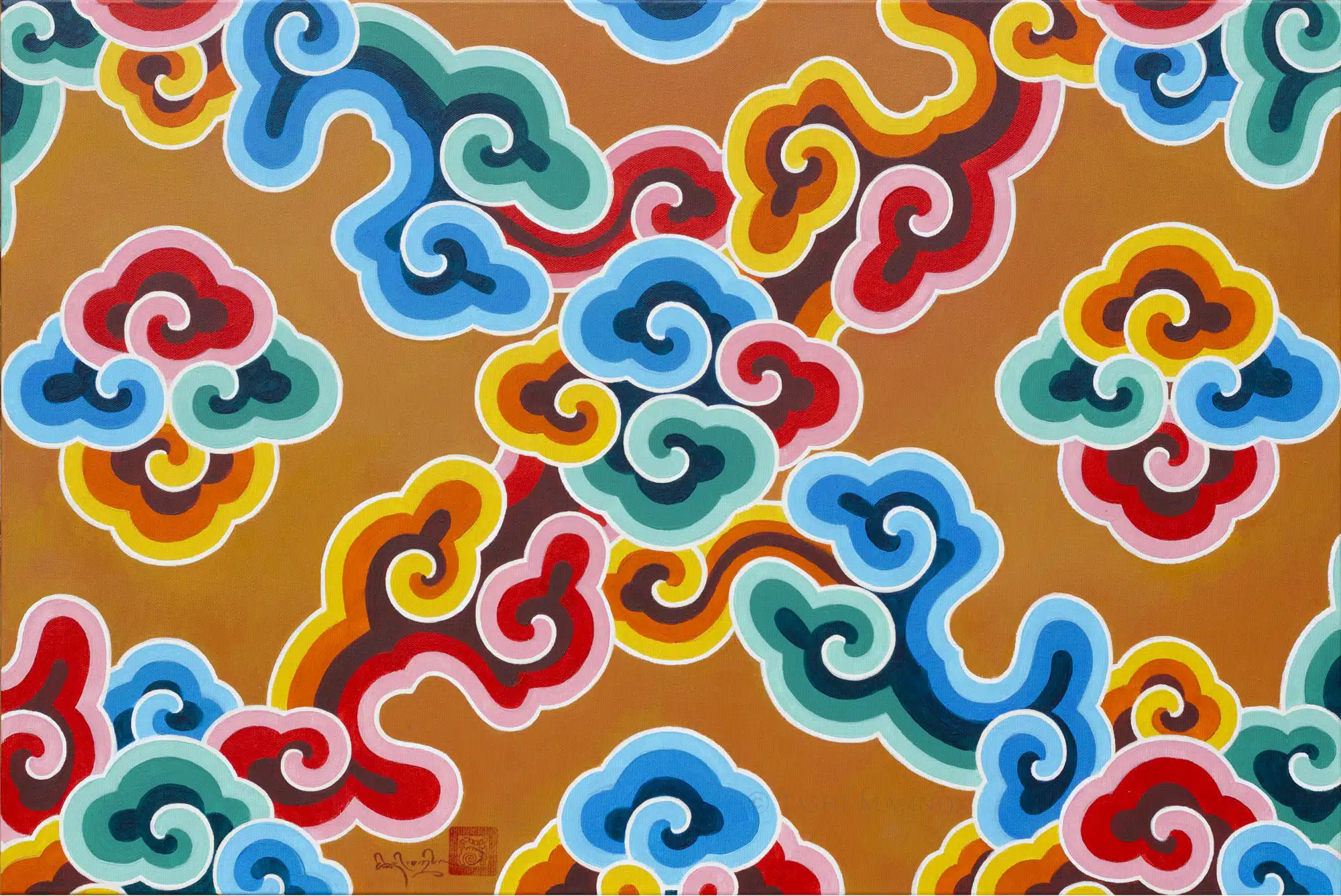
Rainbow Cloud study, Bhutan
Tashi learnt the art of traditional Tibetan temple decoration as an apprentice under Master of Tibetan art, Sherab Palden Beru, during the building of the Samye Ling temple in Scotland.
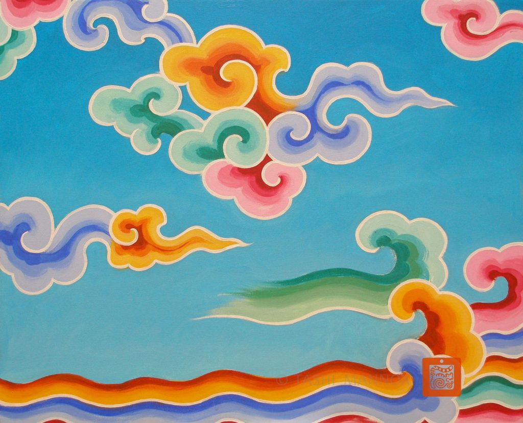
Over many years, Sherab Palden explained that the use of rich colours and patterns was based on the precious jewels described in the construction of a celestial mandala palace. On this basis, the decoration of a temple is intended to uplift and inspire, as well as to celebrate and honour the house of Dharma – such as this typically joyful rainbow cloud design.
Specific colour combinations are combined as complementary warm and cool hues, such as in simple terms: cool blue colours are set next to warm orange and cool green hues are set next to warm reds.
Then there is the tone of colours, meaning how much white is mixed into the darker pigments. For these rainbow clouds, all light, middle and dark shades/tones must be as equally balanced as possible.
Starting with the yellow and orange hues as the lead to mix the blues and green and red tones. As yellow is naturally bright in tone without needing to be mixed with white.
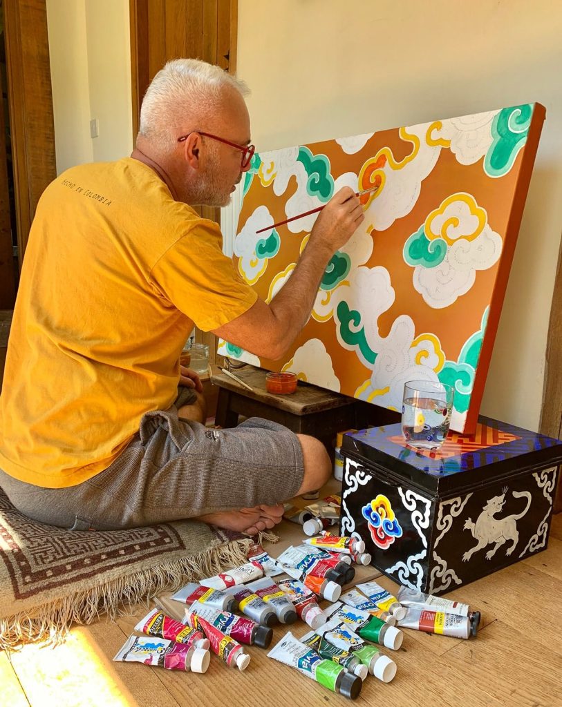
Acrylic on canvas. Dimensions 91 x 61 cm. Created 2020
Commission Similar Artwork
Occasionally the artist is prepared to create a similar piece in consultation with the client.